Securely connecting officers with people who need them.
Active and Retired Law Enforcement Officers are a valuable resource to those seeking protection and security. But accessing those who are up for some extra work are hard to find. Not to mention vetting possible applicants. I was brought on to the OfficerList team to design “version 2” of OfficerList to make it look professional, safer, and legitimate.
Appear safe and legitimate
One of the biggest goals of “Version 2” is to create a better-looking site but it must appear legitimate since both groups would be giving us identities and money. A clean, beautiful design was needed to convey safety.
Appeal to cops while not alienating employers
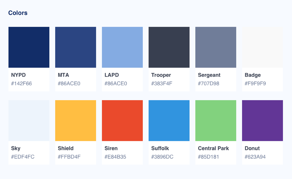
I wanted to make sure that we had a service that felt like a “virtual precinct” (as coined by our founder) but not too far where our employers would feel alienated. I picked a color palette that came from police officer uniforms and gear that felt at home for officers and familiar to employers.
Make it work everywhere
We found our current users we mostly on phones so we decided to design everything mobile first. From wireframing to design, we started on the phone first to ensure a smooth experience while keeping in mind a smooth transition up to the tablet and desktop screens.
Planning
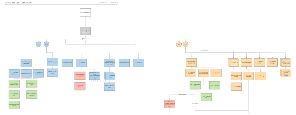
App Map
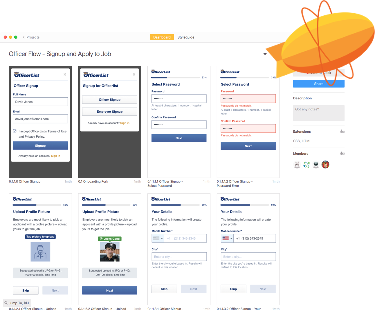
I worked with the team to create an app map which helped us get concrete on required pages to design, flows to be aware of, and to refer back to when presenting to the dev team. Each page was given an ID that was carried from the map to the final design.
OfficerList App Map
Wireframes
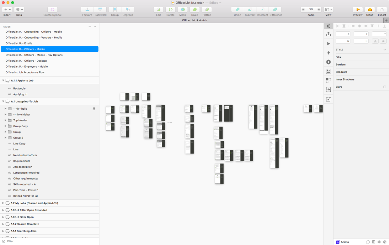
I created over 80 pages of wireframes from the onboarding, resetting password, applying to job, to the transactional emails that were sent. Each page had callouts and notes that pointed out key elements and interactions so everyone was on the same page.
All of our wireframes, designs, and prototypes were done in Sketch.
Wireframes all had callout notes for key features which helped the dev team but most importantly helped us remember our decision on things.
Design
Color, inspiration, and mood
I wanted to create a familiar officer-like color palette that would feel at home to officers and familiar to civilian employers. I looked to police uniforms, badges, cars, and gear to pull colors from.
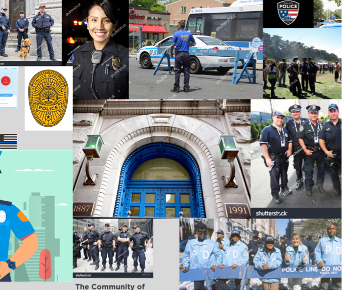
Some of those photos also made it to the moodboard, which was a selection of photos and images that conveyed the right mood to our product and marketing. I researched other law enforcement sites, job sites, and UI that I liked for design inspiration.
OfficerList color palette was derived from law enforcement uniforms and gear.
Moodboard
Inspiration
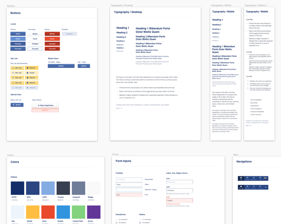
Styleguide
Using the palette and the wireframes, I went through and created a styleguide that would be a Sketch library to quickly pull from but also the 1 point of truth for the dev. team. For mobile web users, I optimized readability by setting the type slightly smaller and tighter while on the desktop it was slightly bigger and taller line-heights (leading).
Part of the styleguide, from the Sketch Library file. When designing, I relied on this library to construct all the pages which created a even, consistent feel throughout.
Design
Combining both the wireframes and the styleguide, I designed all the pages so the dev. team had a clear representation of each page.
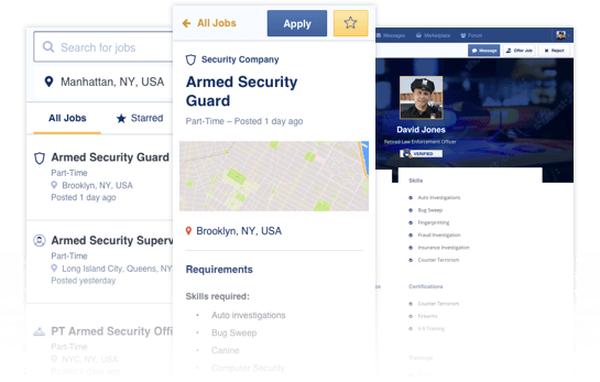
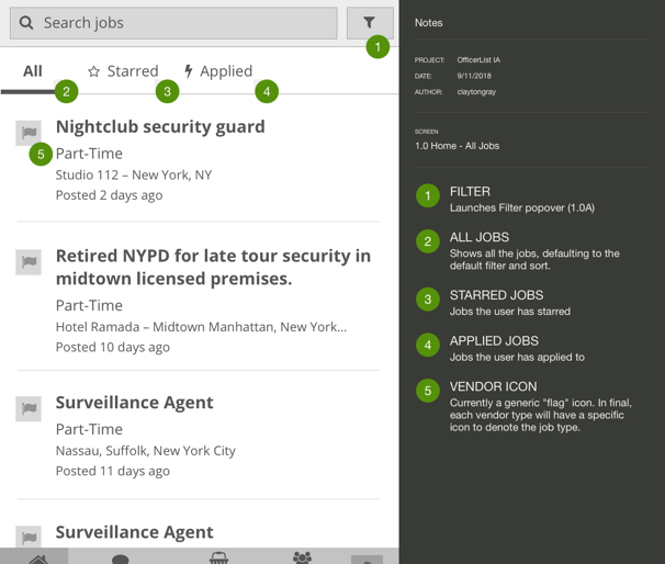
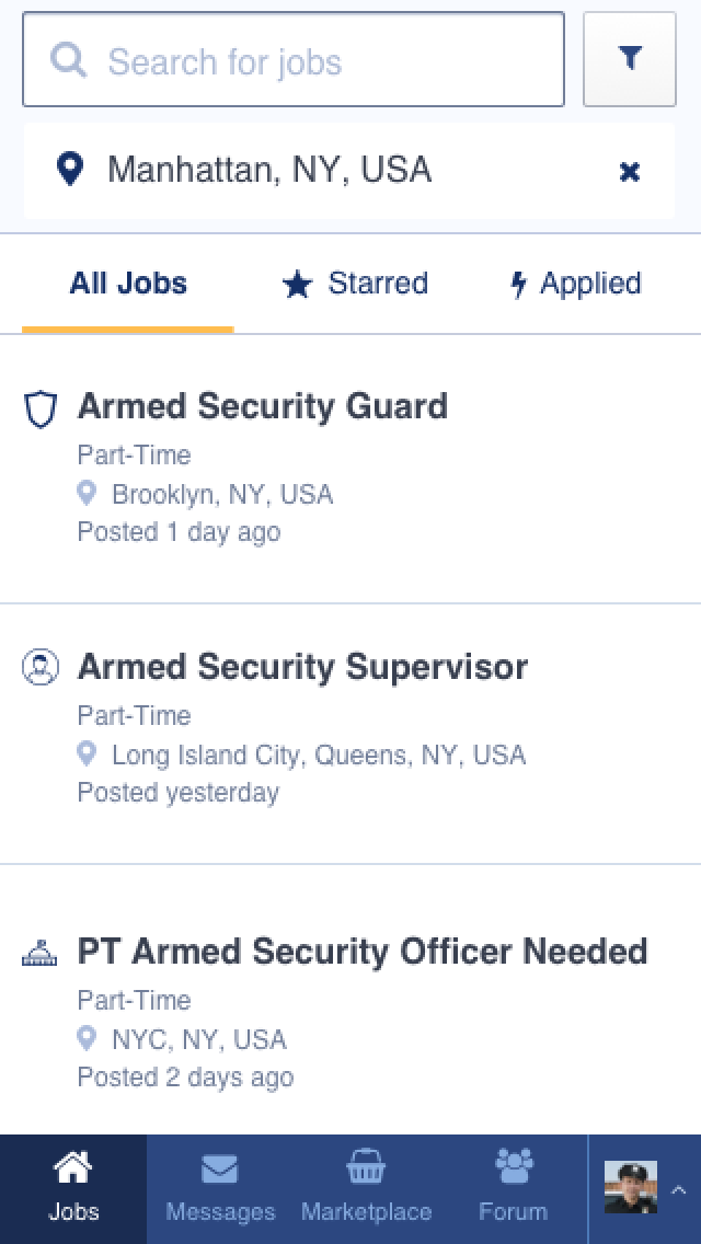
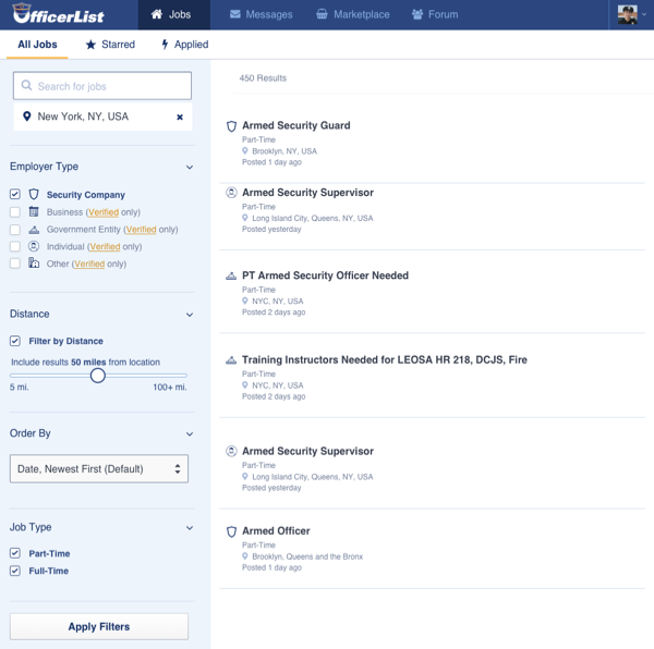
Job listings for an officer, each icon represents a different employer-type.
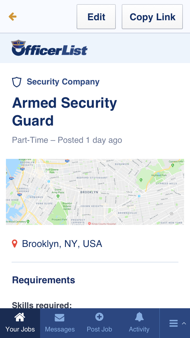
Job listing, employer view. From here they can return to editing or share it.
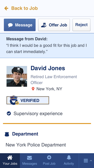
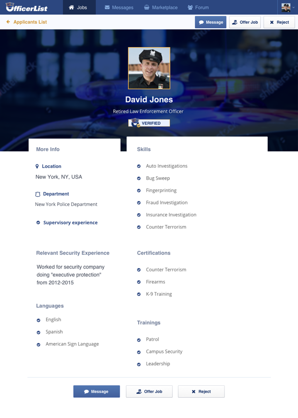
Officer resume, a key differentiator for us. We make it easy for the employer to understand the officer's skills and if they're a fit.
Job listings on desktop. The filter menu is presented on the left instead of behind the filter button.
Officer resume, desktop view. This is a key differentiator for us. We make it easy for the employer to understand the officer's skills and if they're a fit.
Prototyping
Using the designed pages, I prototyped the entire application using Sketch + InVision. Looking back, this is something we probably should have done during the wireframing phase but we were constantly refining what we had so it felt like we were to jump into design when we did.
We sent it out to our testing group of a few active users, friends, and some anonymous test groups while actively testing it ourselves. These prototypes are still updated today from feedback and are actively relied on by the development team. Contact me if you’d like to see the prototypes.
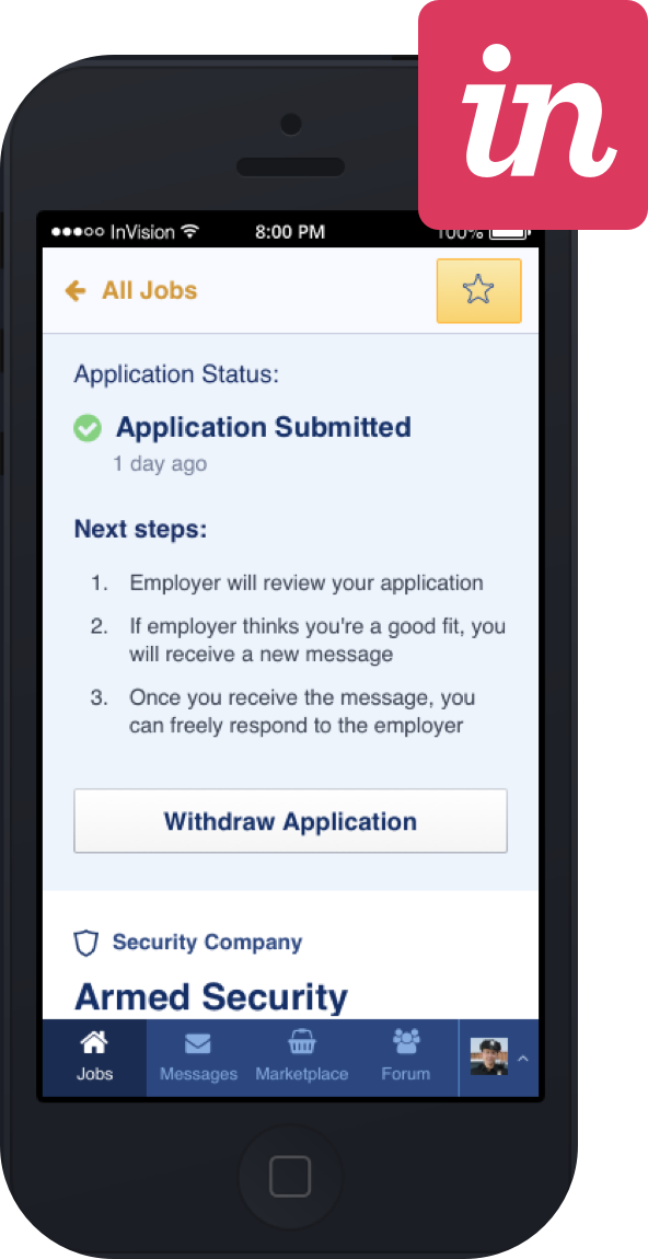
I used Sketch + Craft plugin to create 5 InVision prototypes for different flows.
Handoff and Support
Prototypes and Zeplin
The development team received links to prototypes and was invited to our Zeplin project. Both are still updated and actively referred to while we are building this application.
I used Zeplin to handoff the design files to the development team so they could download all the images and CSS directly for a clear and concise finished product.
Tech Liaison
I am the primary contact for the development team for technical questions and I offer my advice for implementation techniques. Knowing what it takes to build this helps me communicate with the development team in their language and back to the product team so everyone is on the same page.
Outcomes
Version 2 has launched, community grows daily
OfficerList has attracted more employers and officers than the previous version which has been an awesome feeling. We're seeing officers and jobs posted daily now, and OfficerList has been accessed from more than just the Northeast.