Bell on the right
- Uses the top right of the screen that is not being used.
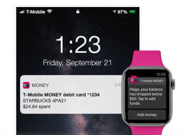
- Fun little shake when the screen loads when there is a notification.
- White "takeover" animation for opening the activity.
- Sets expectations with "content skeletons" while the information loads.
- Playful build animation
Bell on the left, less icons
- Simplifies the left side of the screen to 1 icon. Any activity or notifications would live underneath this icon.
- Simple slide up animation for the panel to ground it in the users experience.
- Separates out notifications from the other less timely actions that can be taken.
- Sets expectations with "content skeletons" while the information loads.
- Playful build animation
Bell on the left, less icons 2
- Simplifies the left side of the screen to 1 icon. Any activity or notifications would live underneath this icon.
- Fun little shake when the screen loads when there is a notification.
- White "takeover" animation for opening the activity.
- Icons slide out smooth from underneath the bell icon upon load.
- Sets expectations with "content skeletons" while the information loads.
- Playful build animation
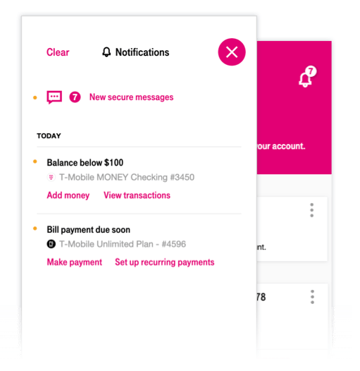
Bell on right, robust panel
- Simplifies the left side of the screen to 1 icon.
- Bell icon doesn't live inside a round button, differentiating it from the buttons on the left.
- Simple slide up animation for the panel to ground it in the users experience.
- A robust panel to handle all kinds of notifications and activity.
- Sets expectations with "content skeletons" while the information loads.


