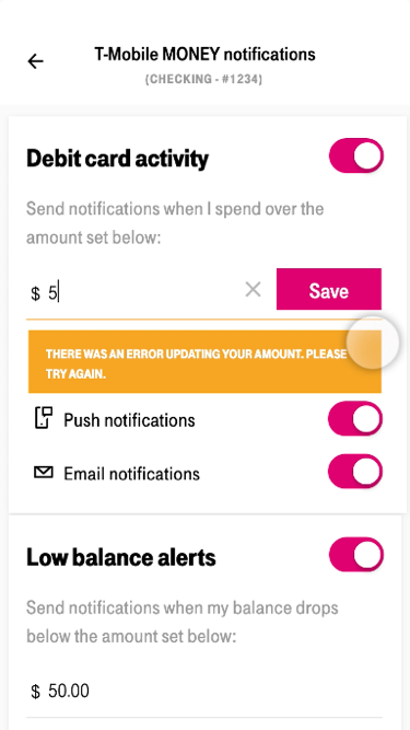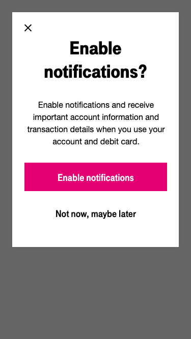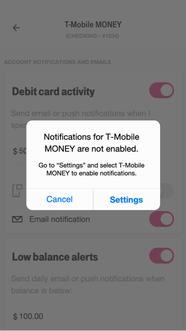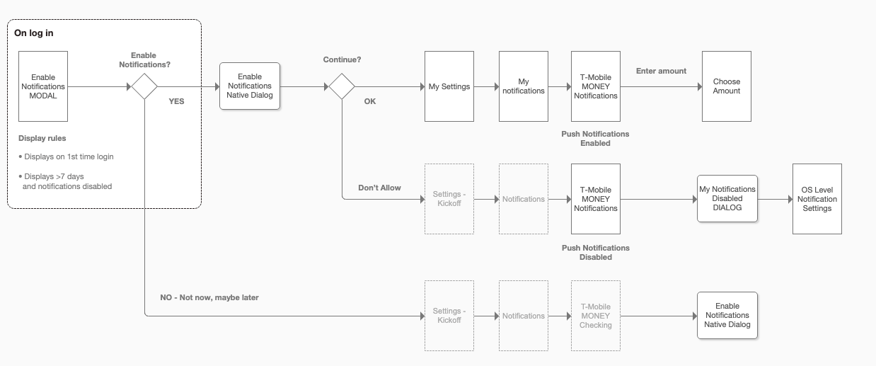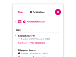
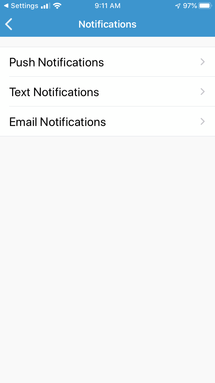
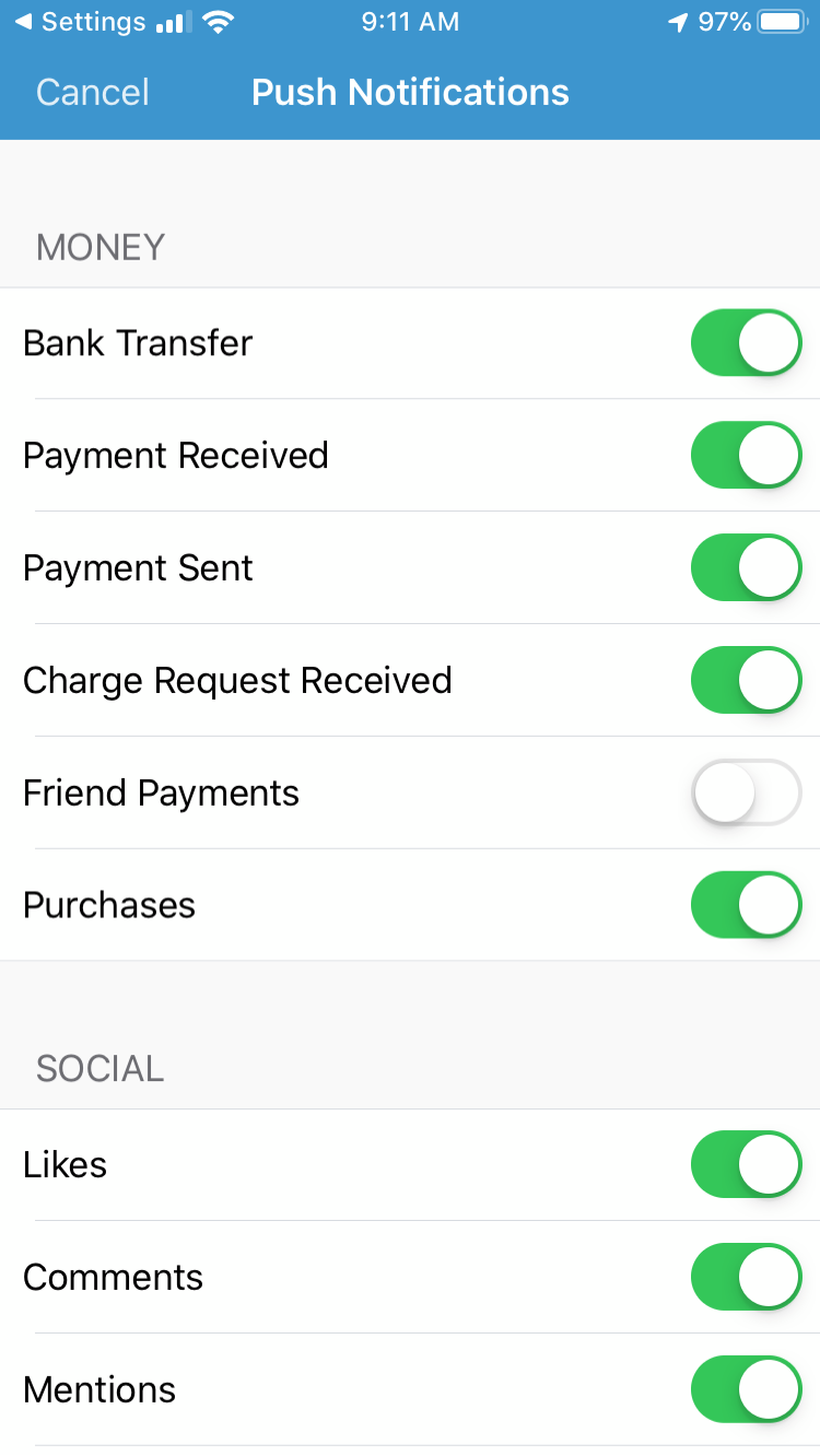
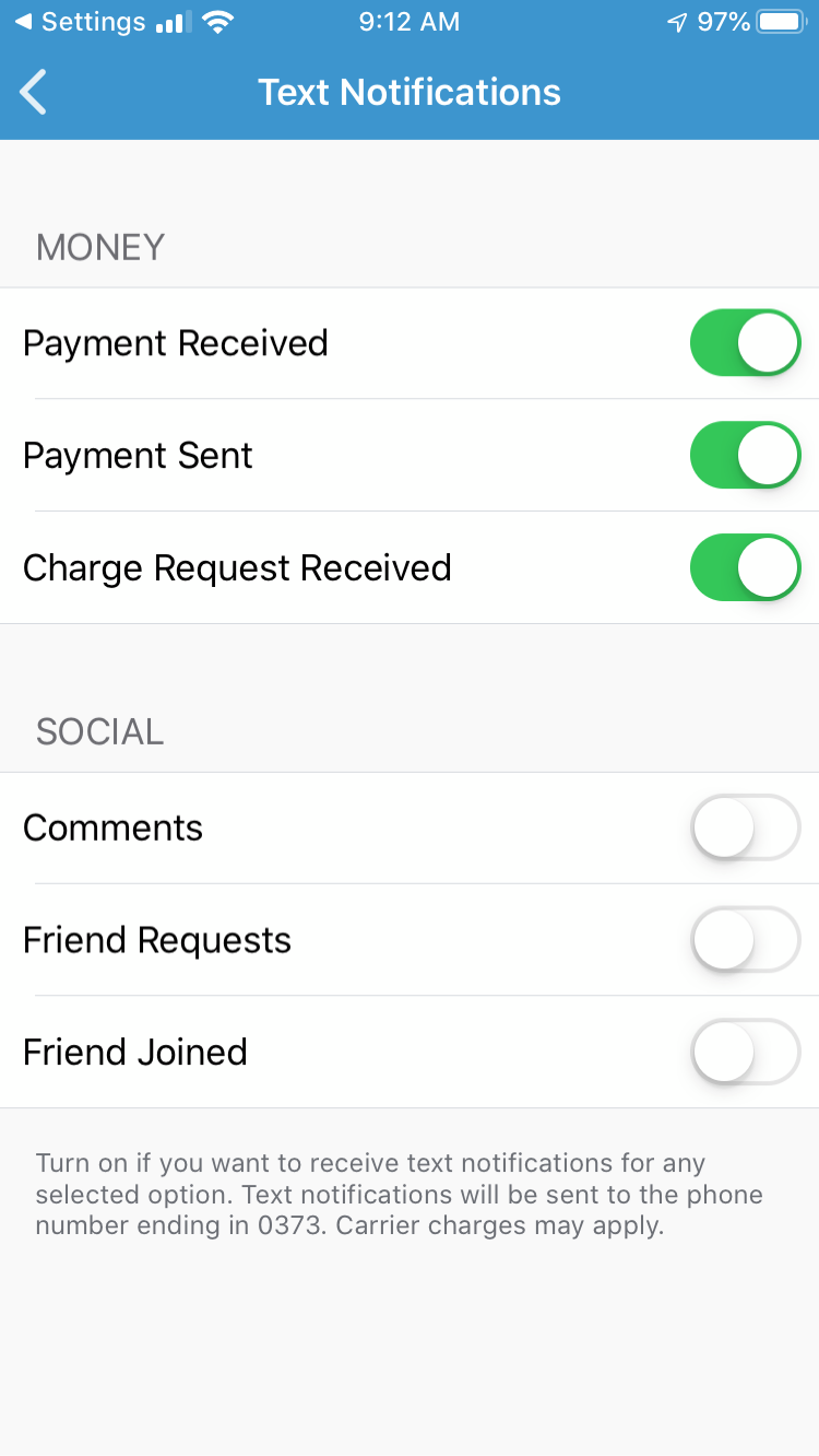
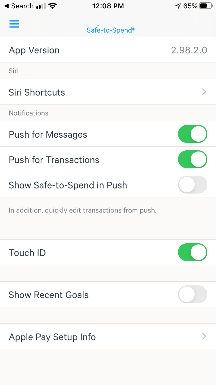
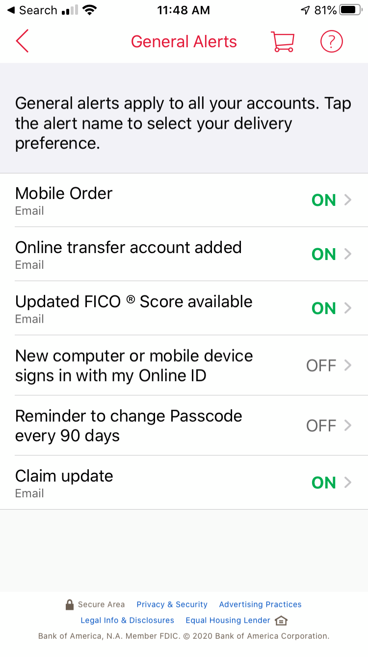
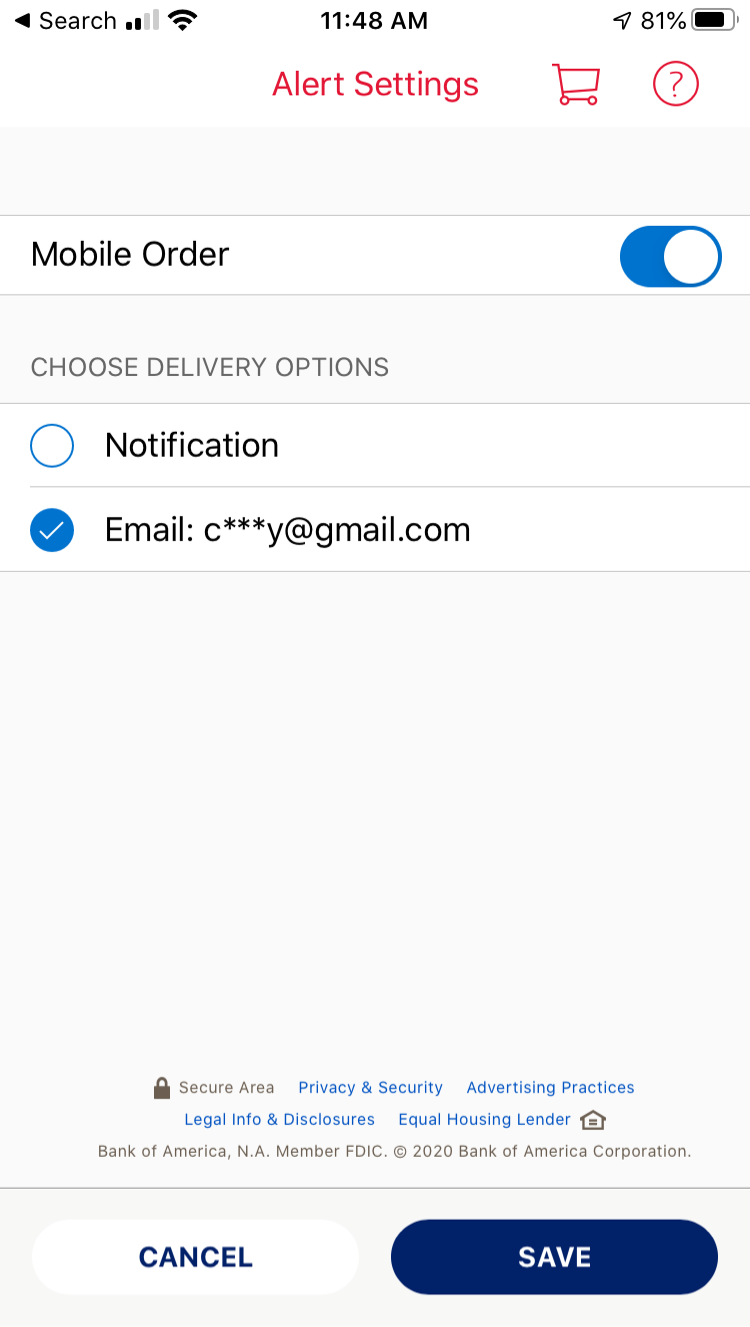
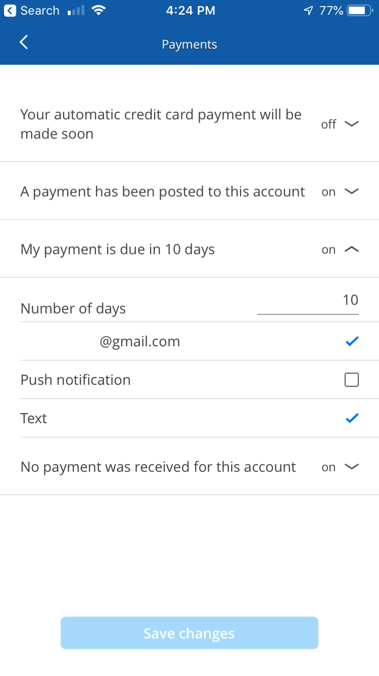
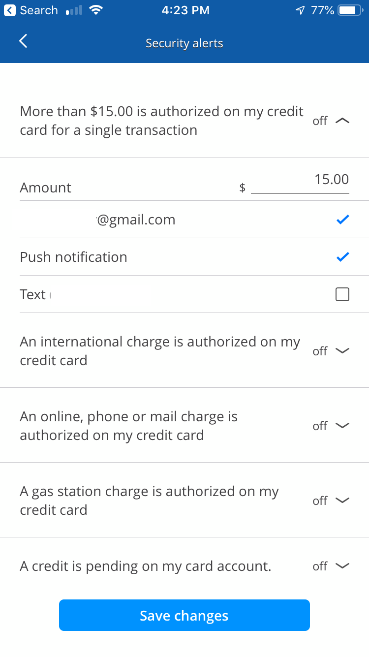
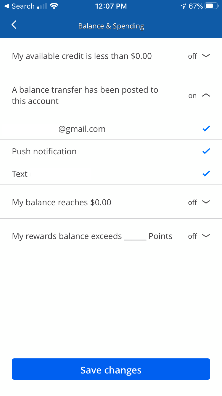
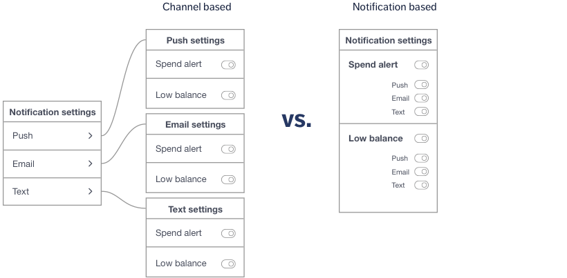
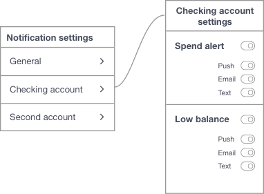
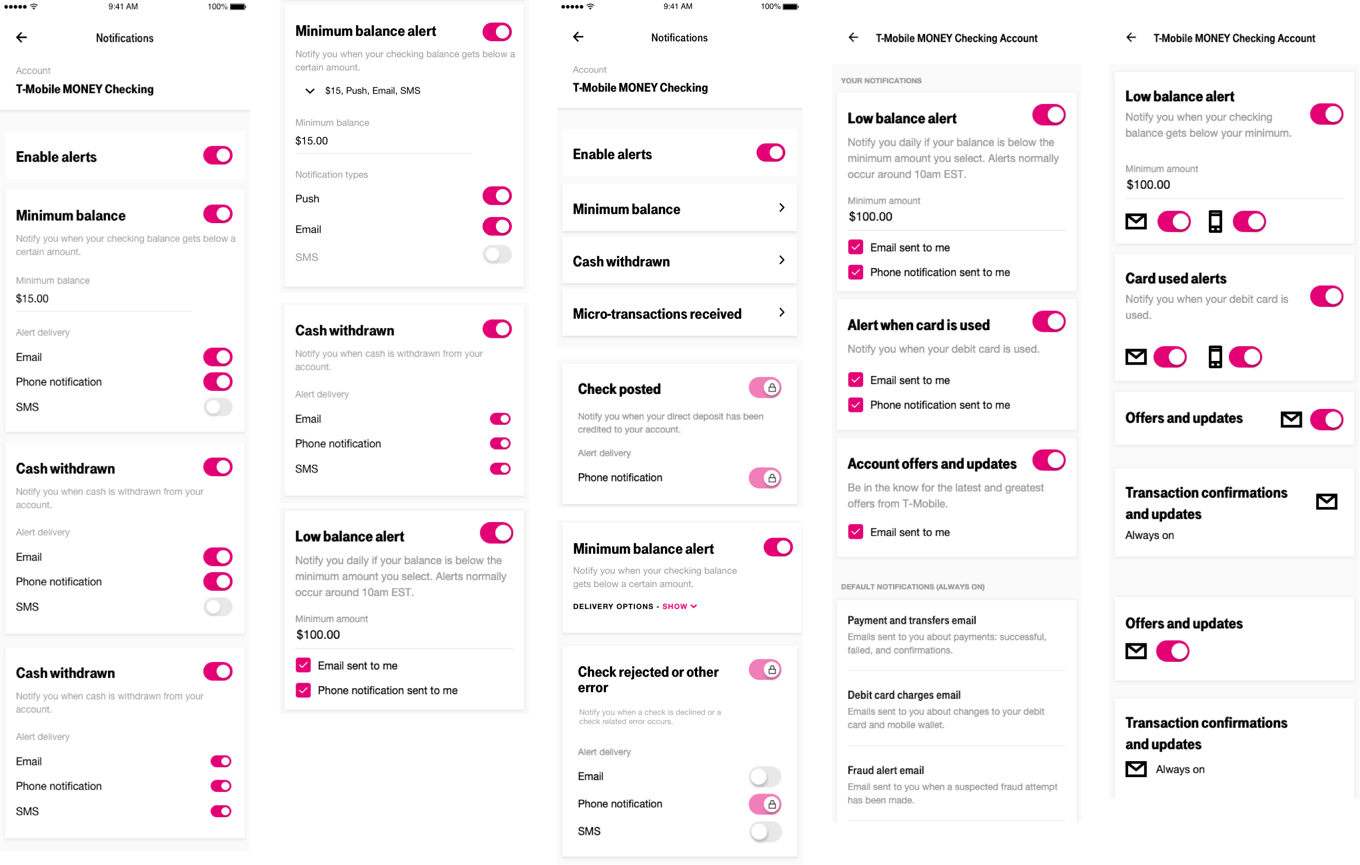
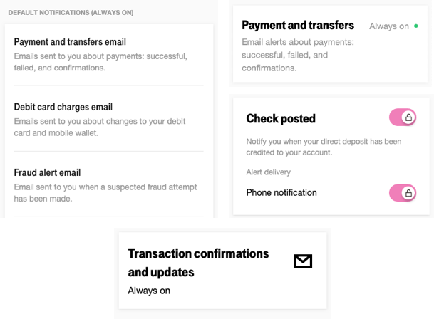
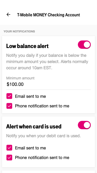
Turning off notifications and channels
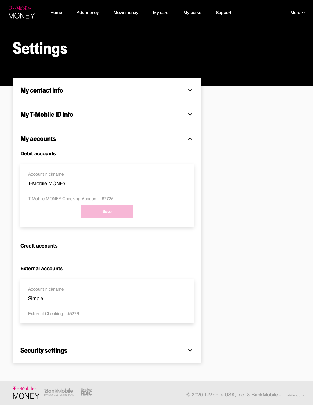
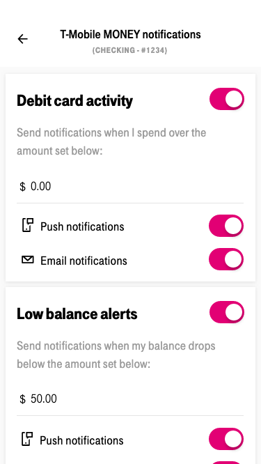
Users should be able to edit each channel at the notification-level. I wanted to explore what happens when they turn off all channels or if they turn the whole notification off. I created a prototype to show the interactions of toggling a notificatio and its channels.